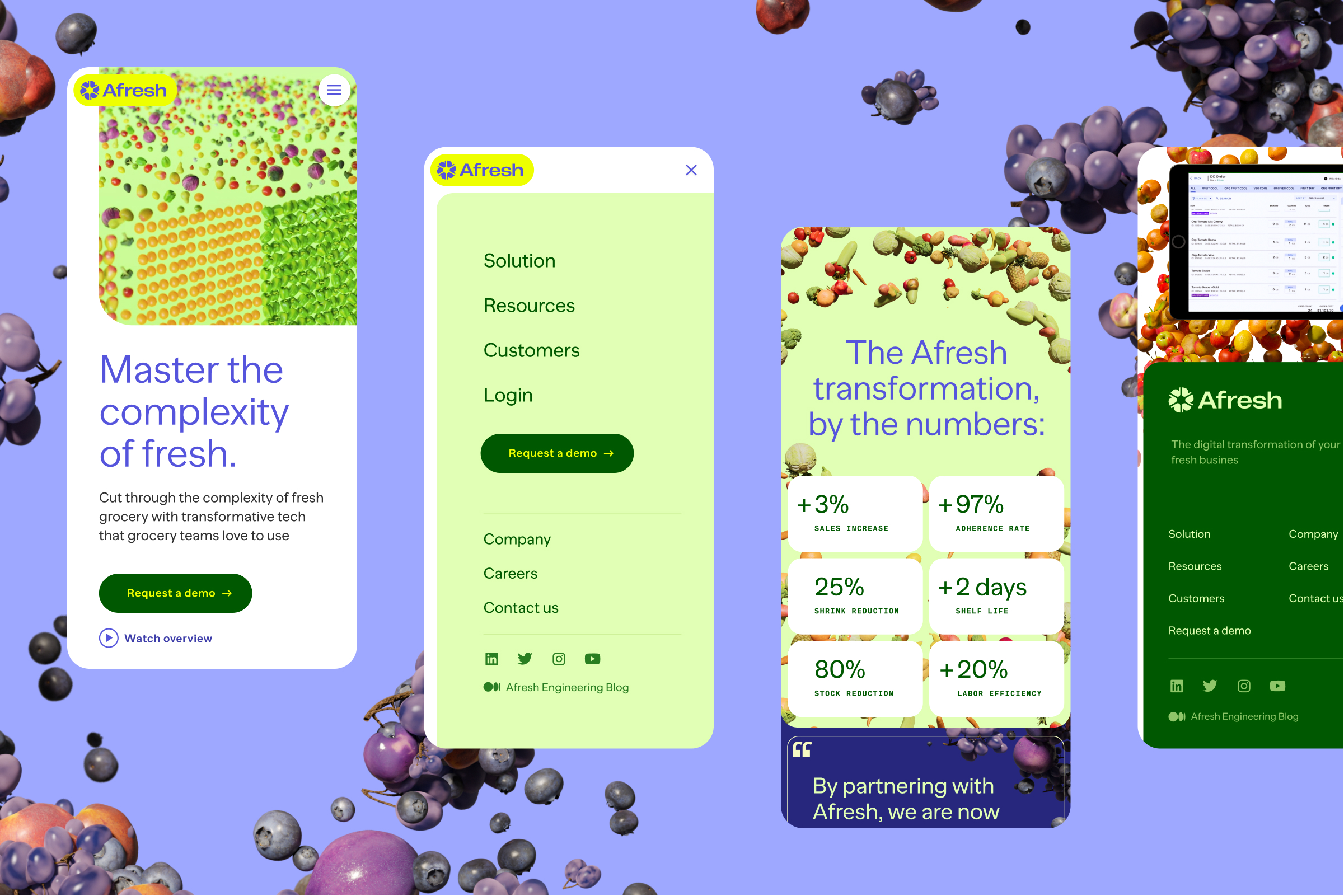
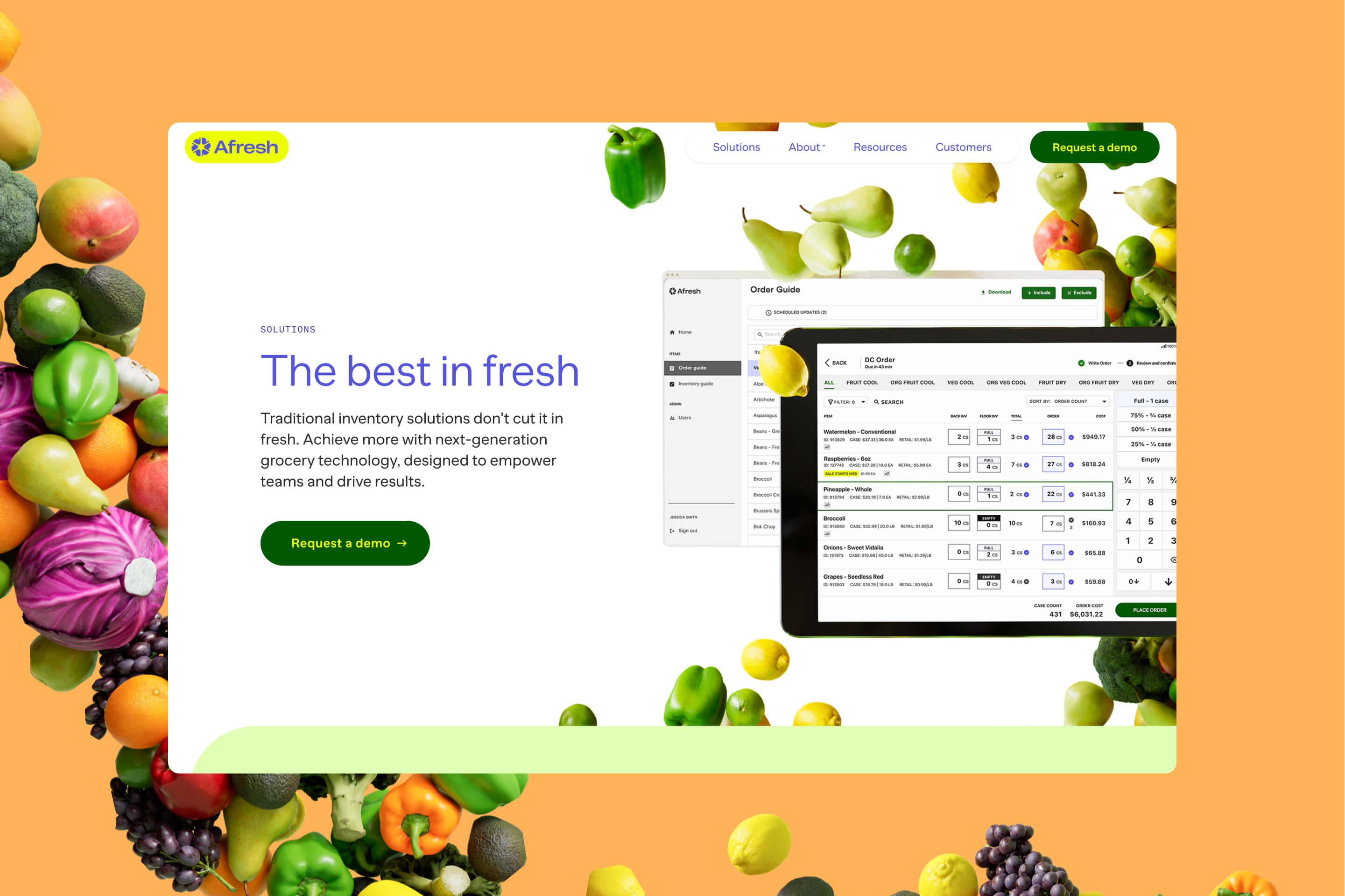
Reinventing the fresh department
At Upperquad we have create their new vibrant brand and stunning website. See the full case study at upperquad.com.
A flexible information system
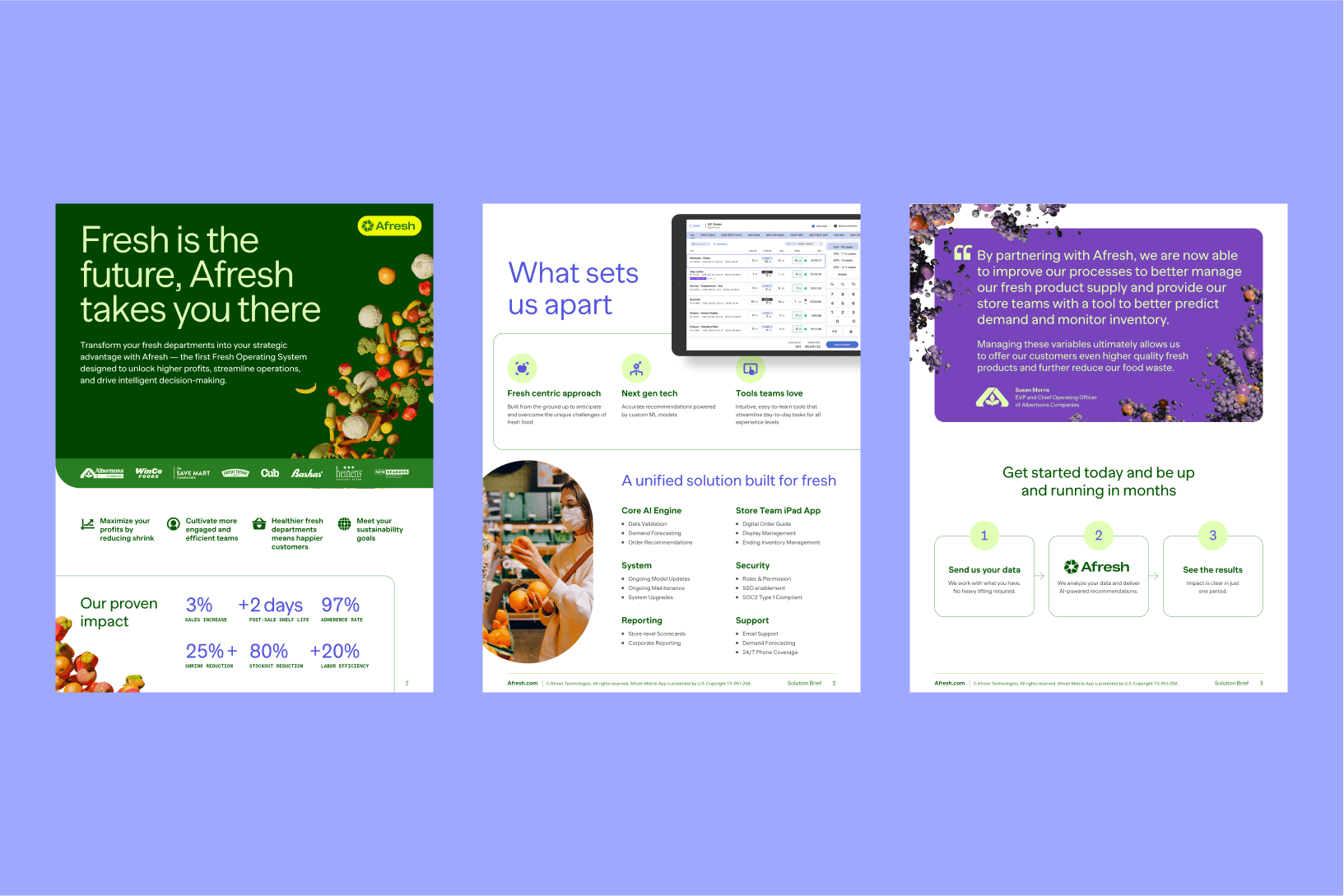
We were thrilled when the Afresh picked one of the most ambitious of our proposed concepts for the brand. This direction made abundant use of 3D renderings of produce to represent, data, optimization and the unpredictability of the fresh department nuances.
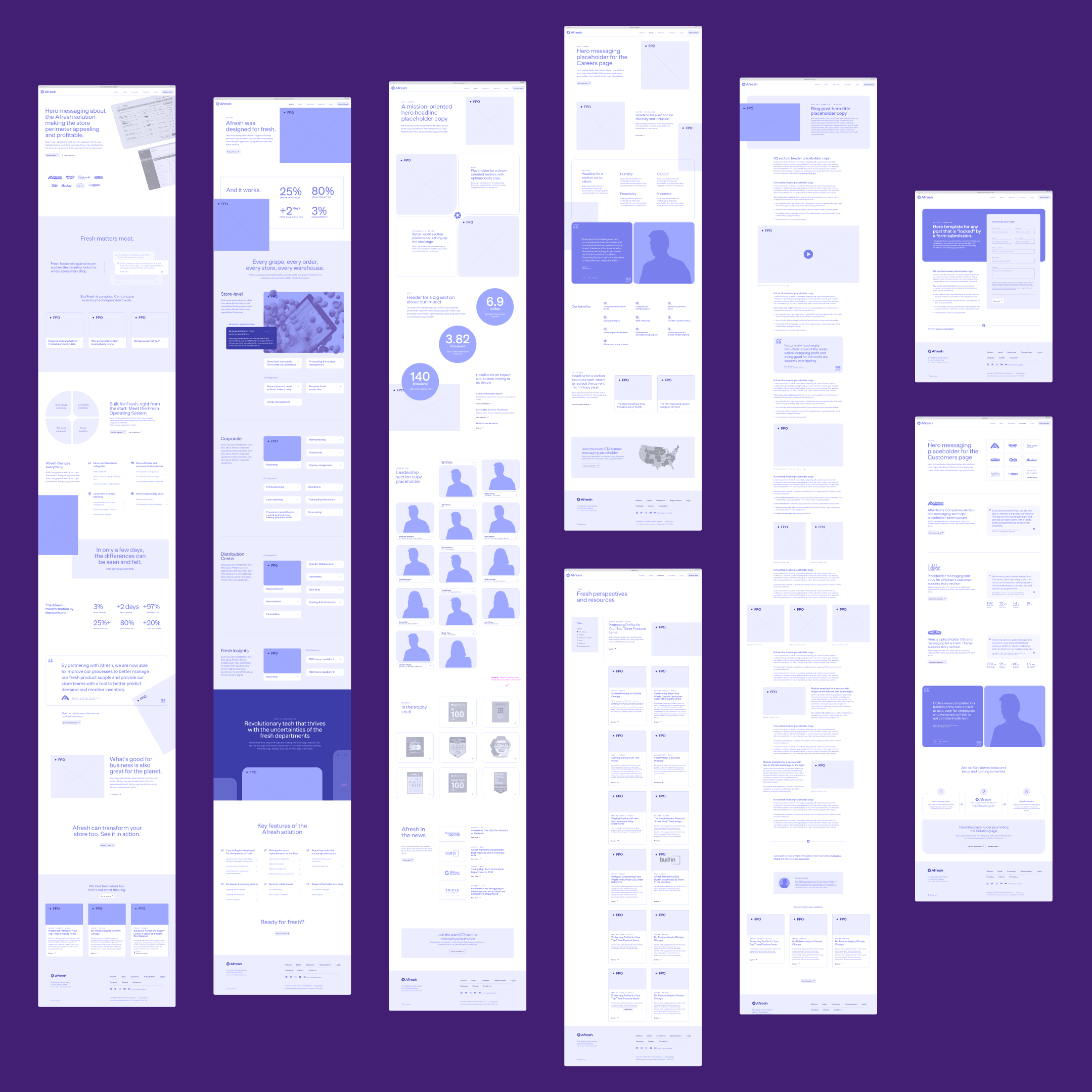
With that as a solid foundation, we set off to plan the website. I took the lead on information architecture, producing site-maps, high fidelity wireframes and interactive prototypes.
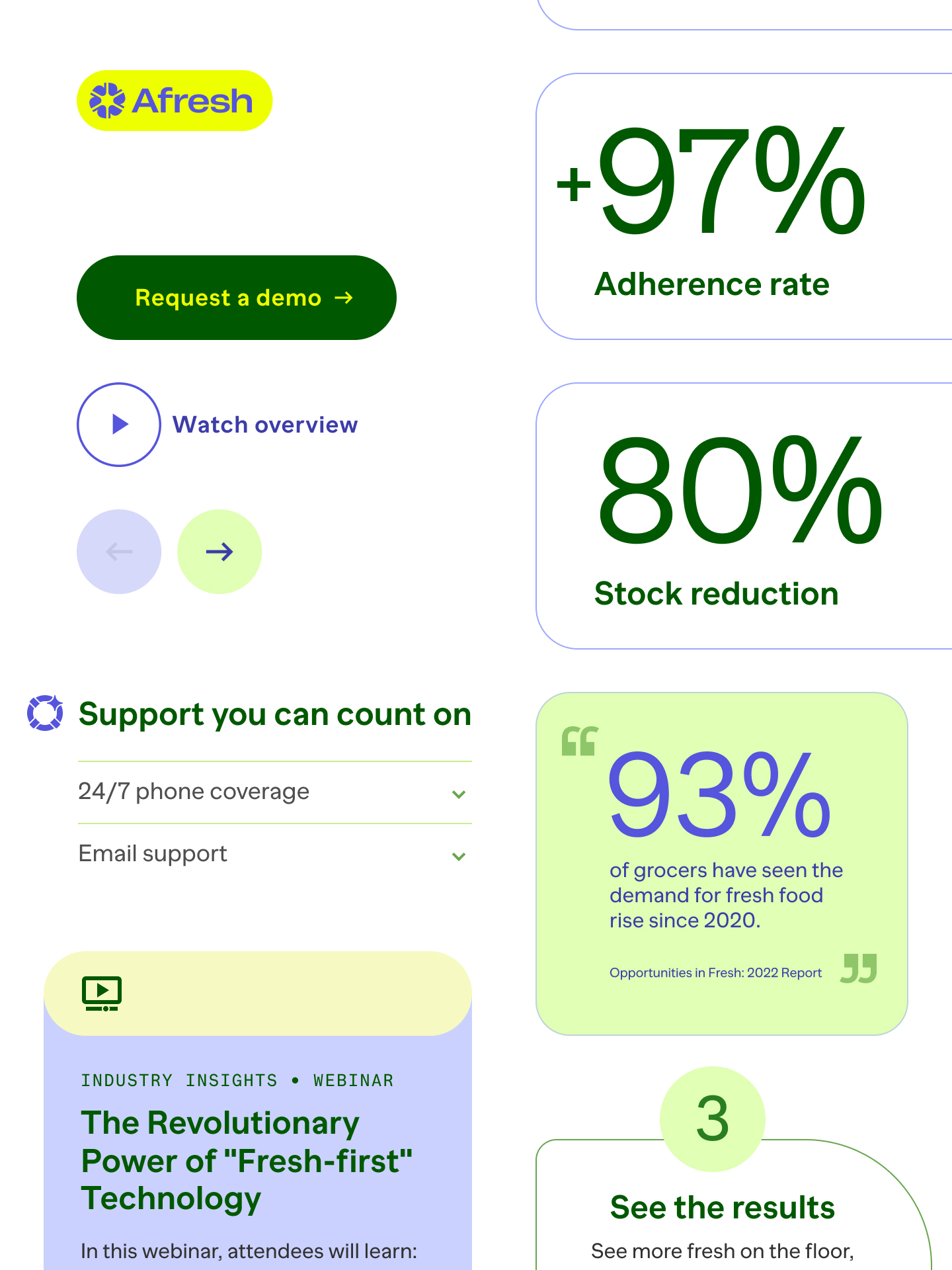
How to visualize both uncertainty and efficiency?
Afresh faced a big challenge in visually expressing their unique selling point — their state-of-the-art AI technology that helps manage the unpredictability of fresh supply chains.
To visualize the duality of uncertainty versus optimization, we have unleashed our "food-as-data" metaphor. A colorful world of produce would sometimes be displayed as explosive constellations, or react in unexpected motion, while at other times come together as orderly efficient solutions, depending on the narrative and pace of the website pages.
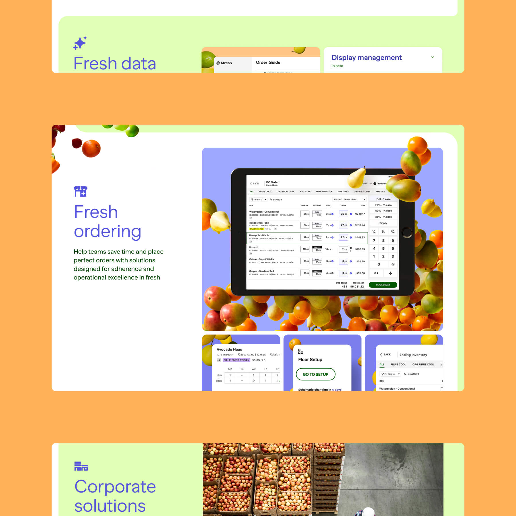
A future-ready, adaptable product page
Our second major challenge for the website was to set up a future-proof product page that, at the same time, gave the team the tools to host a lot of technical information, while also tucking it away when needed.
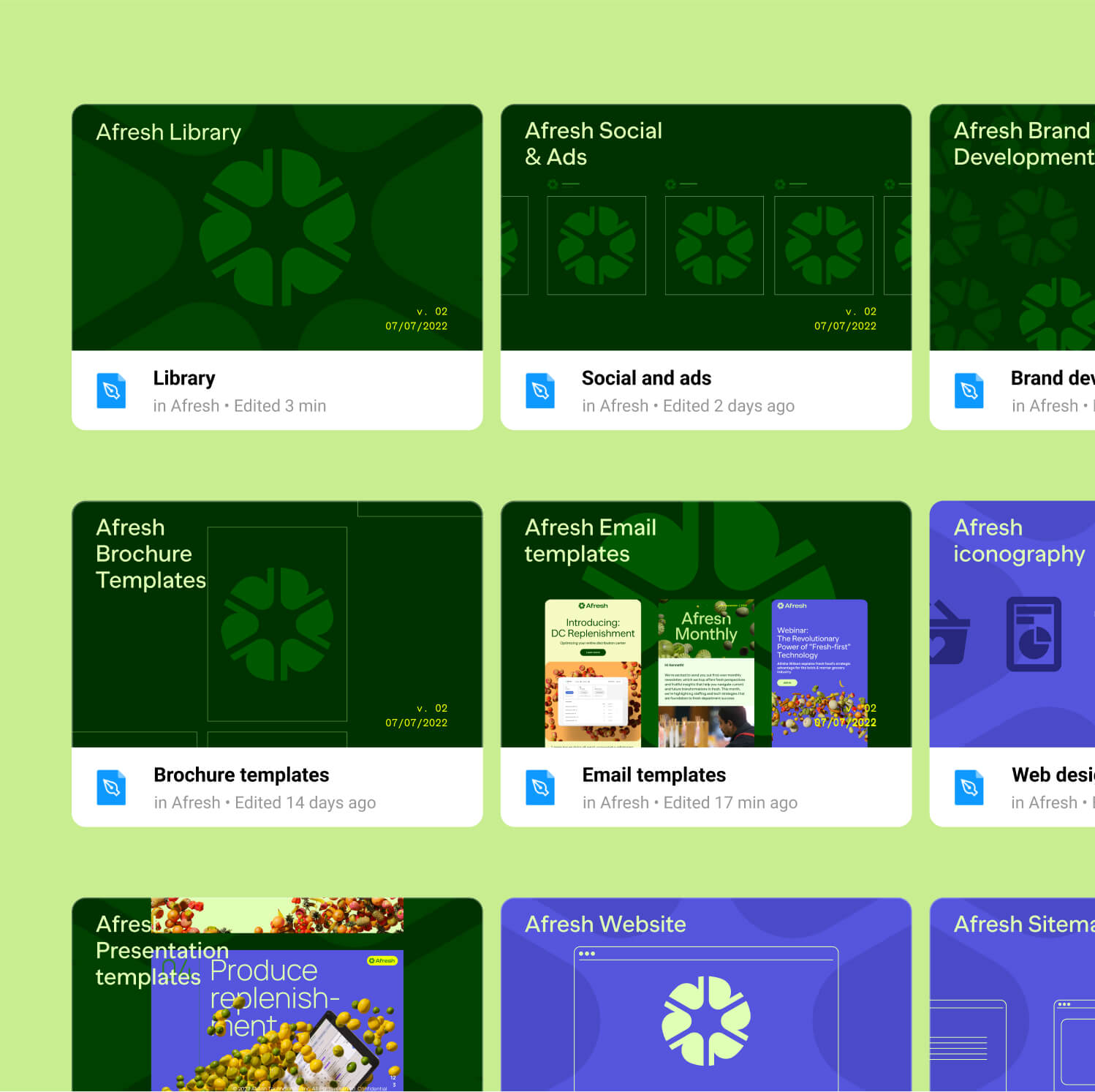
We have designed a variety of UI tools for the team to surface and give clear hierarchy to different sets of content. Cards, accordions, expandable panels and side trays provide flexible hierarchy and also clearly label what features are available, in beta testing or in development.

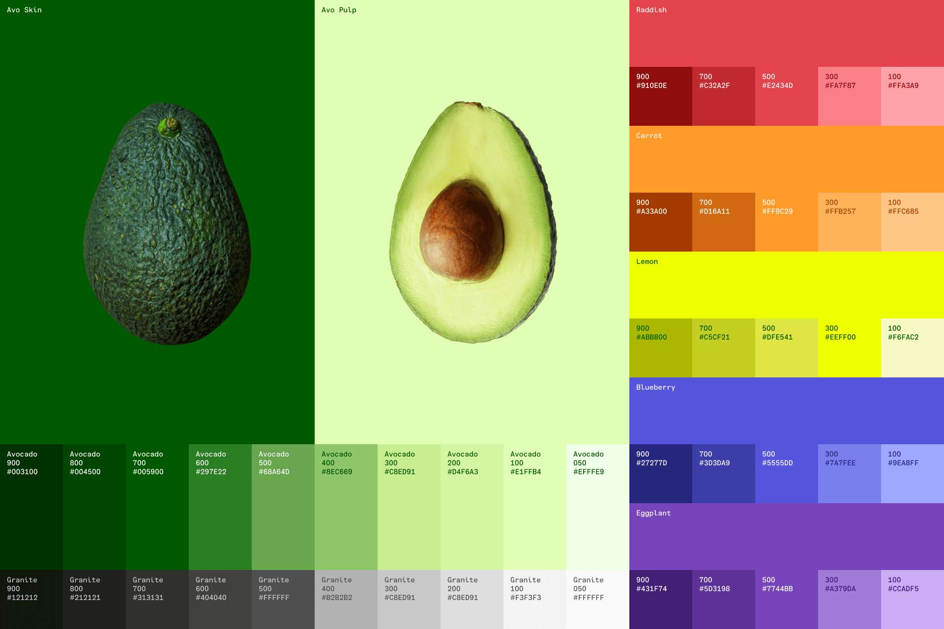
Iconography
Contrastig with the maximalism of the 3D render explosions, we kept the iconography simple and minimal. The solid chunky shapes also provided a differenciation point from competitors, most of which use monoline icons.

